Excel: Formula to Return an Answer Closest to a Target
Hi. Please see the attached example spreadsheet. Just looking for a formula (no arrays, please) that returns a blood pressure reading from a list that is closest to the ideal blood pressure of 120/80.
Thanks!
EE1.xlsx
Thanks!
EE1.xlsx
So, in the sample, you're looking for the values of Tuesday?
ASKER
gerwinjansen:
Actually, Tuesday's reading is better.
Though the Systolic value for Wednesday is exactly 120, the Diastolic value of 91 is quite a way off from the ideal 80 reading.
Collectively, Tuesday's reading is closer to the ideal 120/80 target I'm looking for (1 away from the ideal 120 Systolic reading, and 2 away from the ideal 80 Diastolic reading.)
Thanks!
See attached sample (yes: I meant Tuesday)
ee-find-lowest.xlsx
ee-find-lowest.xlsx
Same idea as used in gerwinjansen example, but according your request. You should check logic in criteria column. Maybe you should add weights
EE1.xlsx
EE1.xlsx
ASKER
als315:
Thanks -- the formula and return value is what I need, and in the format, too.
Any way I can do this without having to add columns D & E?
The actual spreadsheet this is needed for is comprehensive and as a result, cramped for columns. I know I could add columns and hide them, but recently there is a lot of formatting and re-formatting going on, and columns constantly reappear and become unhidden and confuse things going forward.
Thanks again.
Cactus1994,
Please state in a sentence or two the rule(s) to follow to determine the "best" match.
For example, if you were trying to match 120 / 80 to the following readings, which one wins, and why?
115 / 80
125 / 80
120 / 75
120 / 85
Patrick
Please state in a sentence or two the rule(s) to follow to determine the "best" match.
For example, if you were trying to match 120 / 80 to the following readings, which one wins, and why?
115 / 80
125 / 80
120 / 75
120 / 85
Patrick
So you are not allowing arrays and no extra columns?
Cactus1994,
You mentioned above that you like als315's approach.
This is not meant as a criticism, but using that approach, which reading would you consider "best":
121 / 90
126 / 85
als315's approach rates them the same. Now, which would you pick, and why?
Patrick
You mentioned above that you like als315's approach.
This is not meant as a criticism, but using that approach, which reading would you consider "best":
121 / 90
126 / 85
als315's approach rates them the same. Now, which would you pick, and why?
Patrick
@matthewspatrick - some sort of weight factor must be included, for example: negative deviation of Diastolic 0.1, positive deviation of Diastolic 0.15 - same for deviations of Systolic.
gerwinjansen,
I agree. But it should be up to the Asker to define just what that weighting scheme should be :)
One thing I considered was to take the absolute differences in systolic and diastolic, as als315 did, but to multiply them instead of add them.
There are any number of possible rules that could be applied. We need guidance from the Asker as to what the rule(s) should be, and so far there has been little to no guidance...
Patrick
ASKER
Thanks, guys.
Absent of weightings, in regard to matthewspatrick's question, he nailed it (and me) in that mathematically (and in the absolute) they would all be deserving of a "best" rating, considering each reading of Systolic and Diastolic numbers are individually +/- 5 points of the ideal target. Obviously, the percentage difference of a 5-point variance on the lower diastolic target of 80 would be greater, but that doesn't answer your question properly. The weightings would have to be more clinical than mathematic, and I apologize for not considering this would be a factor before I posted the question.
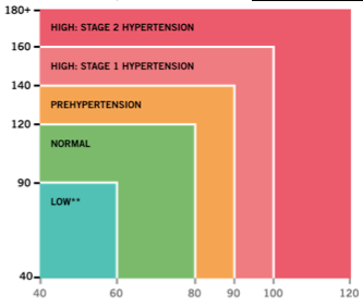
Below is the chart I use in the much larger and more comprehensive analysis. Again in regard to matthewspatrick's question, 115/80 and 120/75 would be the best of the four examples, as they all would fall into the "Normal" range on the chart, while the other two would be in the "PreHypertension" range. (You obviously could not have known that without the chart.)
What now is the best way to write a formula, based on the chart parameters, relative to the original question?

Now we're getting somewhere :)
So, just to clarify: would you always give preference to a reading in the same clinical area on the chart? I ask because if the baseline reading happens to be, say, 119/79, which is just barely within normal, it would arguably be closer to 121/81 (prehypertension) than to 92/62 (normal).
Not trying to be difficult, just trying to get you the answer you need :)
You can use conditional formatting and get something like this (look at sample)
EE1.xlsx
EE1.xlsx
ASKER
matthewspatrick:
No, I love your thought process. I wish everyone I worked with in my day job drilled down to the details to get the best results! :)
Good question. I think we have to consider "LOW" to be as concerning as "PREHYPERTENSION."
That said, a 92/62 would be "better" than 119/79. If the readings were equal and a choice between them had to be made for the result, I would give preference to the lower of the two equal readings.
If you like to have "best" value, you can use this sample (hide or change color of cells, which you don't like to see)
EE1.xlsx
EE1.xlsx
ASKER
als315:
Thanks. You're thinking of all good ideas for various features of the data, and I like it. However, I've got quite a comprehensive analysis going (this is part of a larger health-oriented program) and I have already used conditional formatting for comparison data, and the "Normal," "Low," "Prehypertension," etc. qualifiers in a text and data based result in other areas of the program already. All good stuff.
What I'm really looking for here is just the "best" result from a data table as in my example, in the ###/## format, using the parameters of the BP chart to determine the "best" reading as they fall within the 90/60 - 120/80 range.
Thanks again.
ASKER CERTIFIED SOLUTION
membership
This solution is only available to members.
To access this solution, you must be a member of Experts Exchange.
The colored chart showing low, normal, pre-hypertensive, etc. provides a dangerously misleading picture, in my opinion. Blood pressures of 91/41 and 50/70 are both colored green, suggesting that they are "normal" -- but I think a patient exhibiting either of those readings would not be very healthy.
The better way to make the plot would be to show a minimum and maximum systolic pressure for a "normal" patient at each of the diastolic pressures between 60 and 80 mm Hg. The area between those two lines would then be colored green and labeled "normal". The boundaries for pre-hypertensive and Stage I and Stage II hypertension can be determined similarly.
A chart made this way would not show any color for physiologically impossible situations like systolic pressure being less than diastolic. There would thus be a 45 degree line (systolic = diastolic) on the chart, with all the blood pressure diagnostic ranges being above that line.
Brad
ASKER
Hi Brad:
Incredible responses you've provided. I am constantly amazed at the replies I get to various questions on EE, and yours is one of the most impressive. I'm plugging your reply into my larger spreadsheet now.
Regarding your first post, I am inserting the extra column and using the formula you provided, rather than the array solution. Thank you for both. I had no idea doing something like my this would be as complex as it is, but certainly knew it was well outside my abilities, and understand an added column is absolutely necessary if indeed I need to use a formula instead of an array.
I agree that the colored chart is a bit misleading. Using the example of the 50/70 reading, I would also agree that Px would not be very healthy. Perhaps the makers of this chart intended the X and Y axes to be viewed independently, although their shading would indicate otherwise and leads to misinterpretation. If the X axis systolic value of 50 was viewed independently as landing in the LOW category, and the Y axis diastolic value of 70 was viewed independently as landing in the NORMAL category, then taking two separate indicators away from the chart would be necessary, but the intersection point would not, as XY charts are intended.
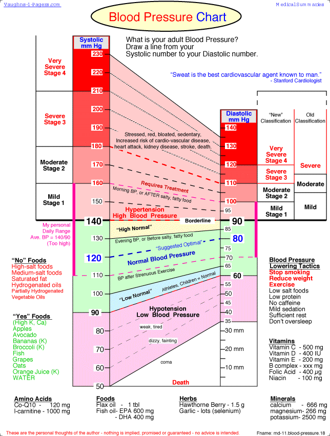
Here's another chart that shows the two readings better. I chose not to include it in my original larger analysis spreadsheet, as it is more complex than simple ... or so I thought. At least this one isn't subject to misinterpretation of a 50/70 reading.

ASKER
Brad:
Everything works perfectly after plugging in your solutions to my larger analysis spreadsheet. Again, I am in awe of the solutions you provided.
I truly appreciate your time, your expertise, your explanations, insight, and of course, the exact solution I was looking for.
Thank you!
Everything works perfectly after plugging in your solutions to my larger analysis spreadsheet. Again, I am in awe of the solutions you provided.
I truly appreciate your time, your expertise, your explanations, insight, and of course, the exact solution I was looking for.
Thank you!
Tim,
Thanks for the kind words! They are much appreciated on a forum like Experts Exchange.
After sleeping on the problem, I decided that my discomfort with the graphical representation of a range of blood pressures into diagnostic groups for normal, Stage 1, Stage 2, etc. is the possibility that the systolic and diastolic readings may belong to different categories. After some more thought, I realized that the diastolic reading is influenced by renal functioning while the difference between systolic and diastolic depends more on the vascular system. With that in mind, it is both possible and meaningful for a patient to belong to two different diagnostic categories.
That said, I decided to flesh out my previous suggestion of defining min and max systolic pressures for each different diastolic pressure. To do this, I took the differences between systolic and diastolic at the beginning and end of each of the ranges shown in your second chart. By adding the smaller difference to the diastolic, I got a minimum corresponding systolic pressure. Likewise, by adding the larger difference, I got the maximum corresponding systolic. Anywhere between the min and max systolic pressure can be clearly assigned to a single diagnostic category. But if you are outside that range, then the vascular and renal functioning belong to different categories.

I also decided to take the square root in the auxiliary column for determining distance compared to the ideal 120/80 reading. You won't need to change the INDEX and MATCH formula that brings back the closest reading, but it will be easier to explain the concept of distance to somebody else if you actually take the square root of the sum of the squares. See attached workbook for implementation.
Brad
EE1-least-squares.xlsx
Thanks for the kind words! They are much appreciated on a forum like Experts Exchange.
After sleeping on the problem, I decided that my discomfort with the graphical representation of a range of blood pressures into diagnostic groups for normal, Stage 1, Stage 2, etc. is the possibility that the systolic and diastolic readings may belong to different categories. After some more thought, I realized that the diastolic reading is influenced by renal functioning while the difference between systolic and diastolic depends more on the vascular system. With that in mind, it is both possible and meaningful for a patient to belong to two different diagnostic categories.
That said, I decided to flesh out my previous suggestion of defining min and max systolic pressures for each different diastolic pressure. To do this, I took the differences between systolic and diastolic at the beginning and end of each of the ranges shown in your second chart. By adding the smaller difference to the diastolic, I got a minimum corresponding systolic pressure. Likewise, by adding the larger difference, I got the maximum corresponding systolic. Anywhere between the min and max systolic pressure can be clearly assigned to a single diagnostic category. But if you are outside that range, then the vascular and renal functioning belong to different categories.

I also decided to take the square root in the auxiliary column for determining distance compared to the ideal 120/80 reading. You won't need to change the INDEX and MATCH formula that brings back the closest reading, but it will be easier to explain the concept of distance to somebody else if you actually take the square root of the sum of the squares. See attached workbook for implementation.
Brad
EE1-least-squares.xlsx